The last three years have seen a significant drop in the cost of housing in the United States; bringing prices back down from once astronomical levels. The enormous increase in housing prices for the past three decades has greatly outstripped the rise in the median annual income. This has made the price of housing as a percentage of annual income rise to new heights. In 2005, that percentage peaked at 473 percent before falling sharply when the credit crisis began in 2007. In 1975, the median annual income was about $12,000. The median home sale price was about $35,000. That made median home prices 297 percent of the median income.
In 1980, the median annual income was about $18,000. The median home sale price was about $60,000. That made median home prices 350 percent of the median income. In 1985, the median income was about $23,000. The median home sale price was about $75,000. That made median home prices 320 percent of the median income. Black Monday occurred on October 19, 1987, and incomes and home prices continued to rise. In 1990 the median income was about $30,000. The median home sale price was about $90,000. That made median home prices 307 percent of the median income.
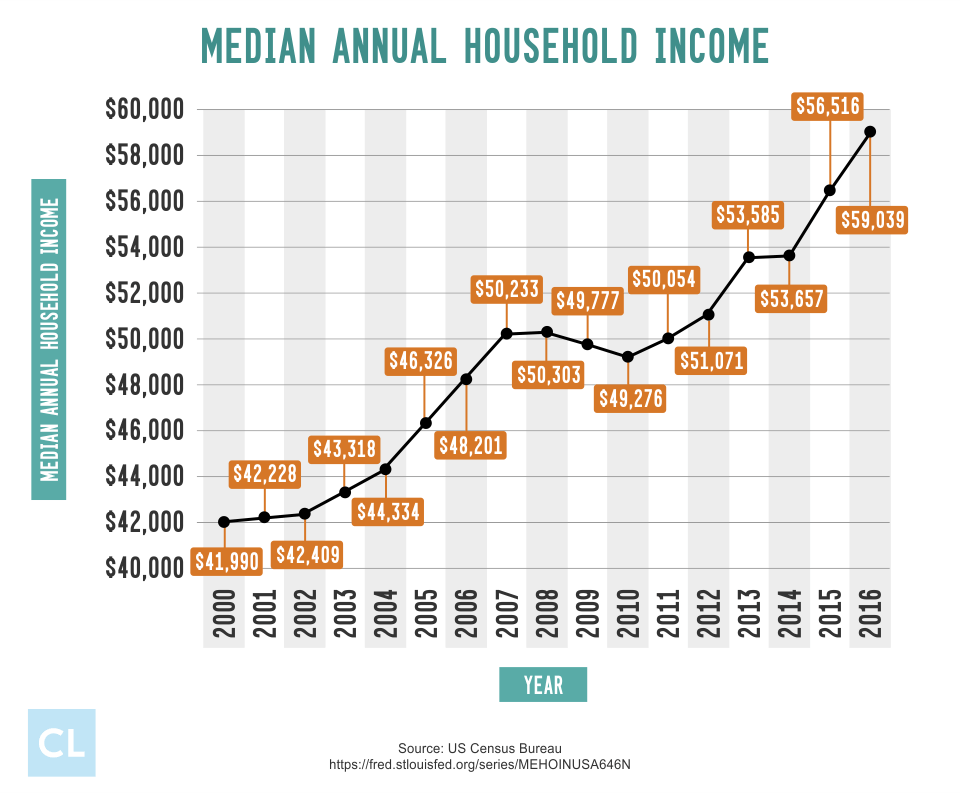
In 1995 the median income was about $34,000. The median home sale price was about $110,000. That made median home prices 324 percent of the median income. In 2000 the median income was about $42,000. The median home sale price was about $137,000. That made median home prices 331 percent of the median income. In 2005 the median income was about $46,000. The median home sale price was about $220,000. That made median home prices 473 percent of the median income. The recession began on December 7, 2007 and housing prices quickly fell. In 2009 the median income was about $48,000. The median home sale price was about $170,000. That made median home prices 363 percent of the median income.
Average 30-Year Fixed Rate

The average 30-year fixed rate has also risen and fallen with the economic times. In 1975, the average 30-year fixed rate was about 9 percent. In 1980, the average 30-year fixed rate was about 14 percent. In 1985, the average 30-year fixed rate was about 12 percent. In 1990, the average 30-year fixed rate was about 10 percent. In 1995, the average 30-year fixed rate was about 8 percent. In 2000, the average 30-year fixed rate was about 8 percent. In 2005, the average 30-year fixed rate was about 6 percent. In 2009, the average 30-year fixed rate was about 5 percent.
Monthly Income vs. Monthly Mortgage

In 1975, the housing debt-to-income ratio was 23.21 percent. In 1980, the housing debt-to-income ratio was 39.26 percent. In 1985, the housing debt-to-income ratio was 32.59 percent. In 1990, the housing debt-to-income ratio was 26.17 percent. In 1995, the housing debt-to-income ratio was 22.69 percent. In 2000, the housing debt-to-income ratio was 23.43 percent. In 2005, the housing debt-to-income ratio was 26.83 percent. In 2009, the housing debt-to-income ratio was 18.84 percent. See what the current average American debt to income ratio is versus other countries in 2017.


